Launched
Tickertape Learn by Tickertape — Senior Product Designer
A platform to learn about managing your finances (2022 - Present)
My Role
I was hired to revamp the (now old) Learn section of Tickertape. I led the product design for Tickertape Learn and built the product 0–1.
I led the end-to-end redesign process, including research, wireframing, high-fidelity designs, and interaction design in collaboration with:
Ujjwal Ankur - CEO
Hashmina Haque - Product Manager
Shyam Athreye - AVP Product
Avishek Das - Android Developer
Let’s start with why redesign the whole thing in the first place?
Problems with the section:
Looks boring, outdated and intimidating.
Doesn’t look and feel user friendly.
Lengthy read.
No way to bookmark or a way to ‘continue’ learning.
Poorly formatted and un structured.
Content shelf life is poor.
Doesn’t show relevant topics.
No way to apply what you learnt.
Along these issues, the CEO's vision for Tickertape directed us to create an experience that would enhance the user's experience of the entire ecosystem. This involved — Users learn about finance (using Tickertape Learn), talk about it (using Tickertape Social) and transact using Tickertape tools, therefore staying within the platform. But figuring out what to build for “Learn” was not so simple.
We wanted to tackle all that + we wanted to enable the “finfluencers” Tickertape closely works with, who create relatable ‘personal finance management’ educational content. A part of the brief was also to enable these finfluencers to create such content for Tickertape Learn. Therefore, the entire scope became, create:
A consumer facing product, where users could consume bite-sized lessons.
An editing tool to enable creators to create these lessons.
Challenges:
Limited to no pre-production user research.
No initial engineering bandwidth.
No initial scope for ‘content strategy’.
Ambitious ‘go to market’ time.
UI design had to be considerate of a transitioning design system.
Fortunately, my experience in building an education product for the previous company I worked at, helped in fast tracking a few decisions.
Coming to building the concept for Learn — we unanimously felt that we needed to build easily consumable lessons where people don’t spend much time in going through the learning content. Therefore the structure of consumption needed be quick and the content needed to be “bite-sized”.
Building on what “bite-sized” means for us, we explored ideas of quick readable content structures in the form of short lessons and short videos.
Let’s talk about — Why lessons?
(This is where I persuade theoretical research, competition analysis and user research)
There’s a pool of information out there, on Youtube, Coursera, Udemy and popular chartered accountant’s personal websites where people have published a lot of educational content but each of them lacked something off of our checklist. The checklist:
The need for short form content —validated by analysing the social media trends — Instagram stories, Reels, Tiktok videos etc. Therefore Coursera and Udemy type platforms fall short here.
The need to feel like “I’m progressing” — Youtube videos and general video based platforms fall short in providing a structure to accommodate a users learning flow. There is no space where a user can go to track and manage their learning progress because those platforms are not designed to fulfill this specific use case.
The need to learn quicker than “4 weeks” or “1 week” — this was validated by our internal form circulated in the company (a research survey with 35 participants) and a majority knew that learning about managing personal finance is extremely important but they won’t go out of the way to sit through a long course. A research done by a Google team also stated “97% of people won’t spend any time actively seeking out new knowledge for their own development.” — which is mind boggling but this validated that we needed to create something easily consumable, something within 5–7 minutes.
Therefore the concept of, short form lessons, text or videos, consumable within 5–7 minutes made sense.
Parallelly we were fiddling with the idea of ‘flashcards’, and how it’s structure helps people consume information in chunks which helps them retain information better.
So the idea to use the concept of flashcards was born!
Now, let’s talk about structure! (UX Architecture — the most exciting part of the process ✨)
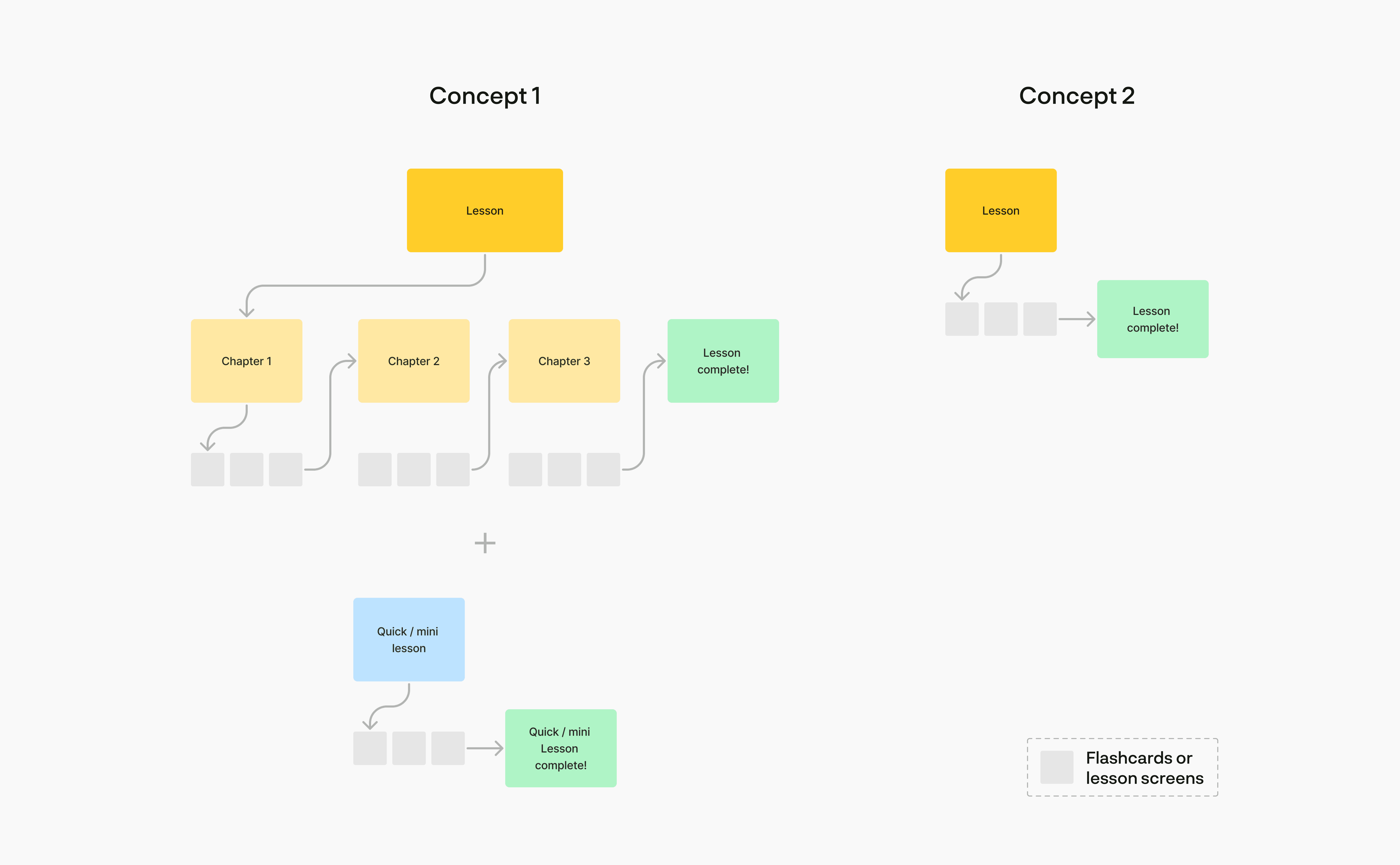
The team chose concept 2 for a number of reasons unrelated to design, so I’m going to skip writing about.
In addition to the above, I worked with the PM to outline the other functions and screens needed to complete the UX:
A lesson thumbnail + details or a widget.
A ‘lesson overview’ screen.
A way to receive feedback.
Functions like ‘share’ lesson.
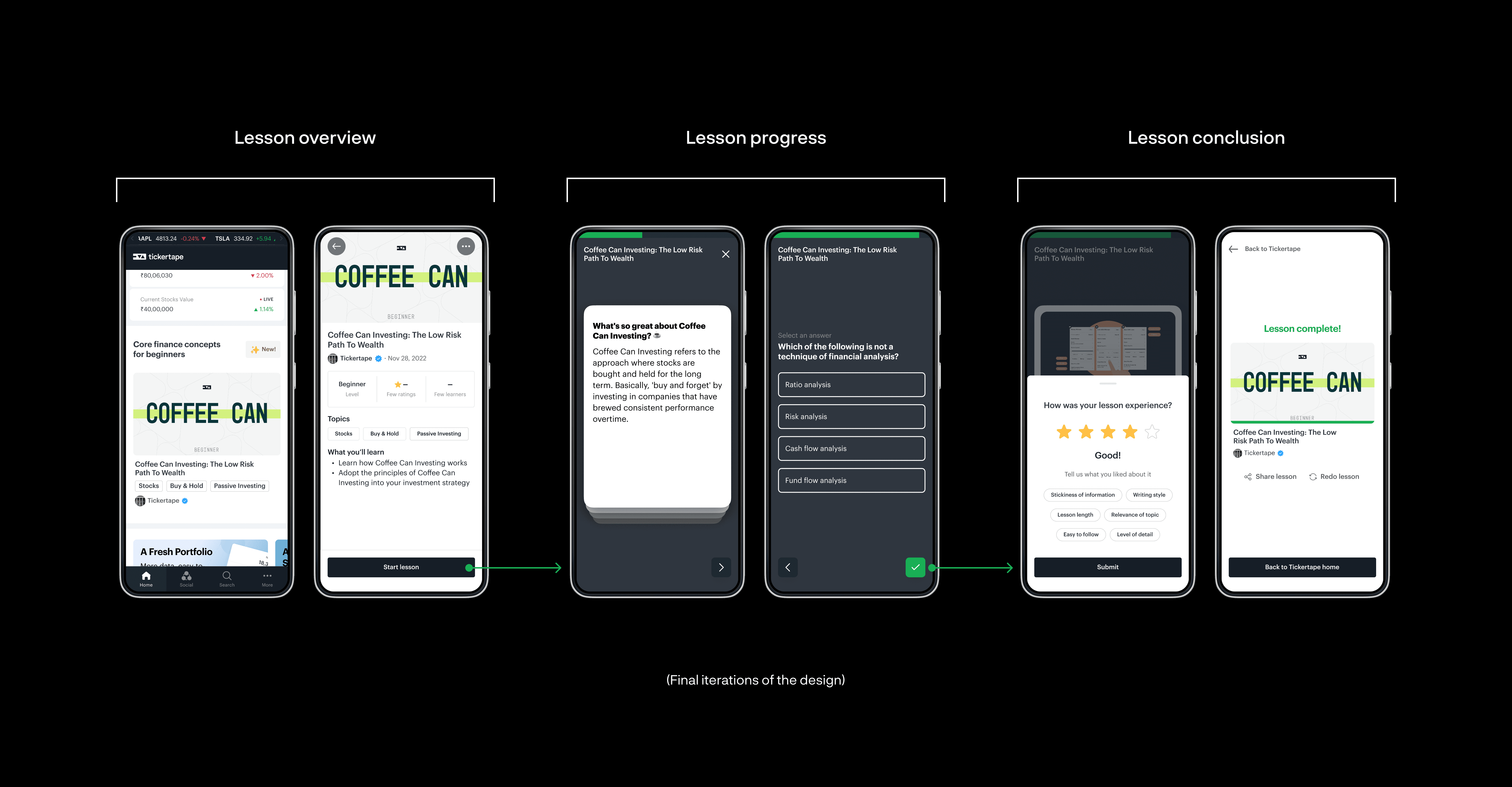
Considering these, I proposed this lesson structure, which became our UX foundation:
Next, I worked on ideas for the type of flashcards and templates we could build for the product. I wanted to make sure we have a healthy mix of interact-able and purely consumption (reading/watching) templates, so that the experience stays engaging.
For version 1, I provided the team with a list of ideas we could integrate into the lesson structure to make the experience usable while keeping it interesting and fun.
I categorised them into two:
Interact-able templates: Requires users intervention to move forward like a quiz or “perceived” interact-able, like a button, etc.
Non-interact-able templates: Consumption or reading/watching templates that didn't need the user’s interaction.
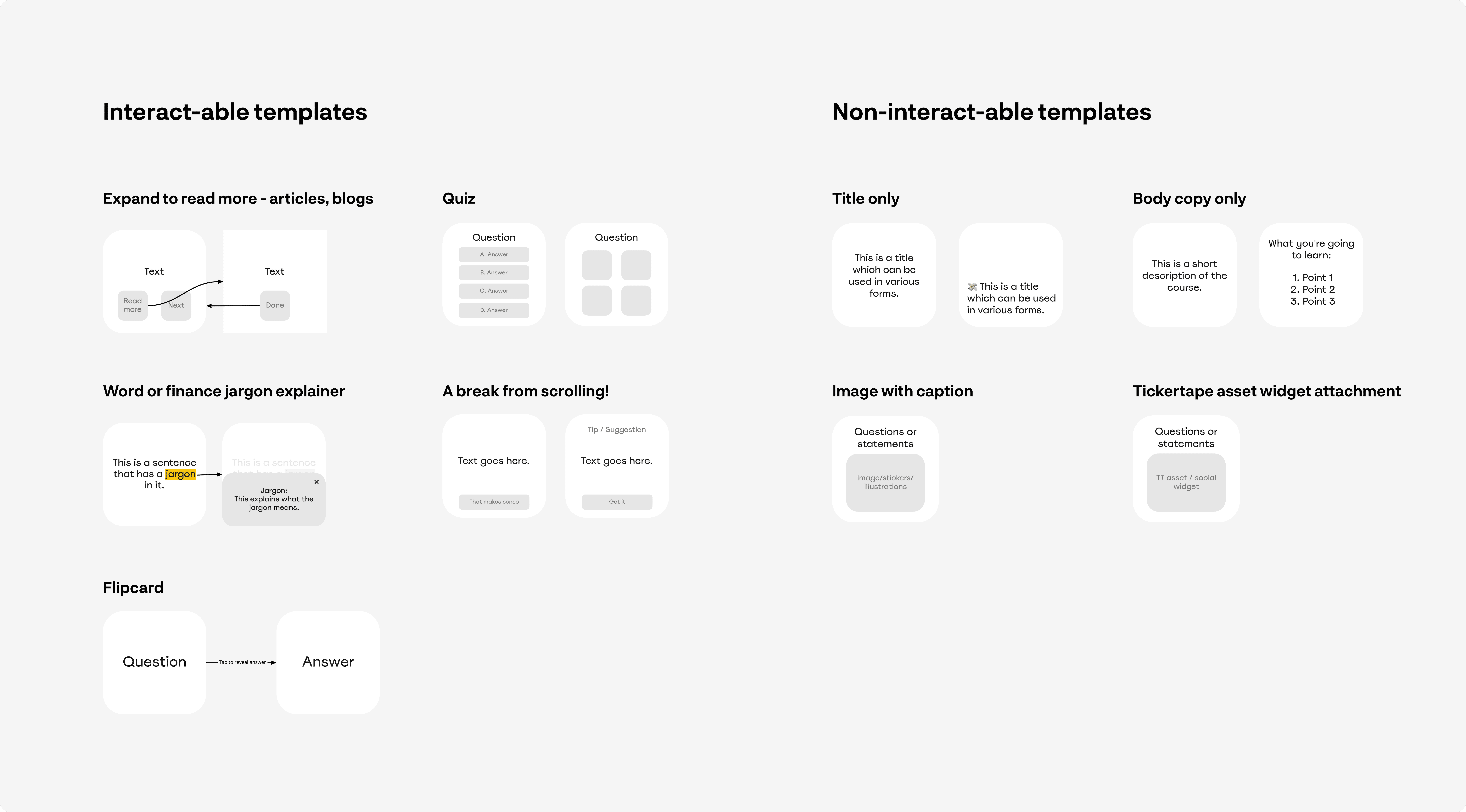
📝 Structurally, the categorisation helped in designing the core difference in the user experience between the two.
The non-interact-able templates became the flashcards. The flashcards were designed to be swipeable.
And, since the inter-actable templates needed the user's intervention, like quizzes, they were designed to not be in the form of flashcards, restricting the user to swipe it away.
This decision made the UX feel dynamic.
Version 1 launch
The first version of the UX was launched as a single lesson widget on Tickertape Home. We released one lesson at a time to gauge user engagement and document the feedback that came in from them.


Along with the basic UX, I created these information architectures to support the engineering team. The IA supported all diverging user flows and conditions we needed to code to make the experience work seamlessly.
Here's a look at the skeleton of the experience:
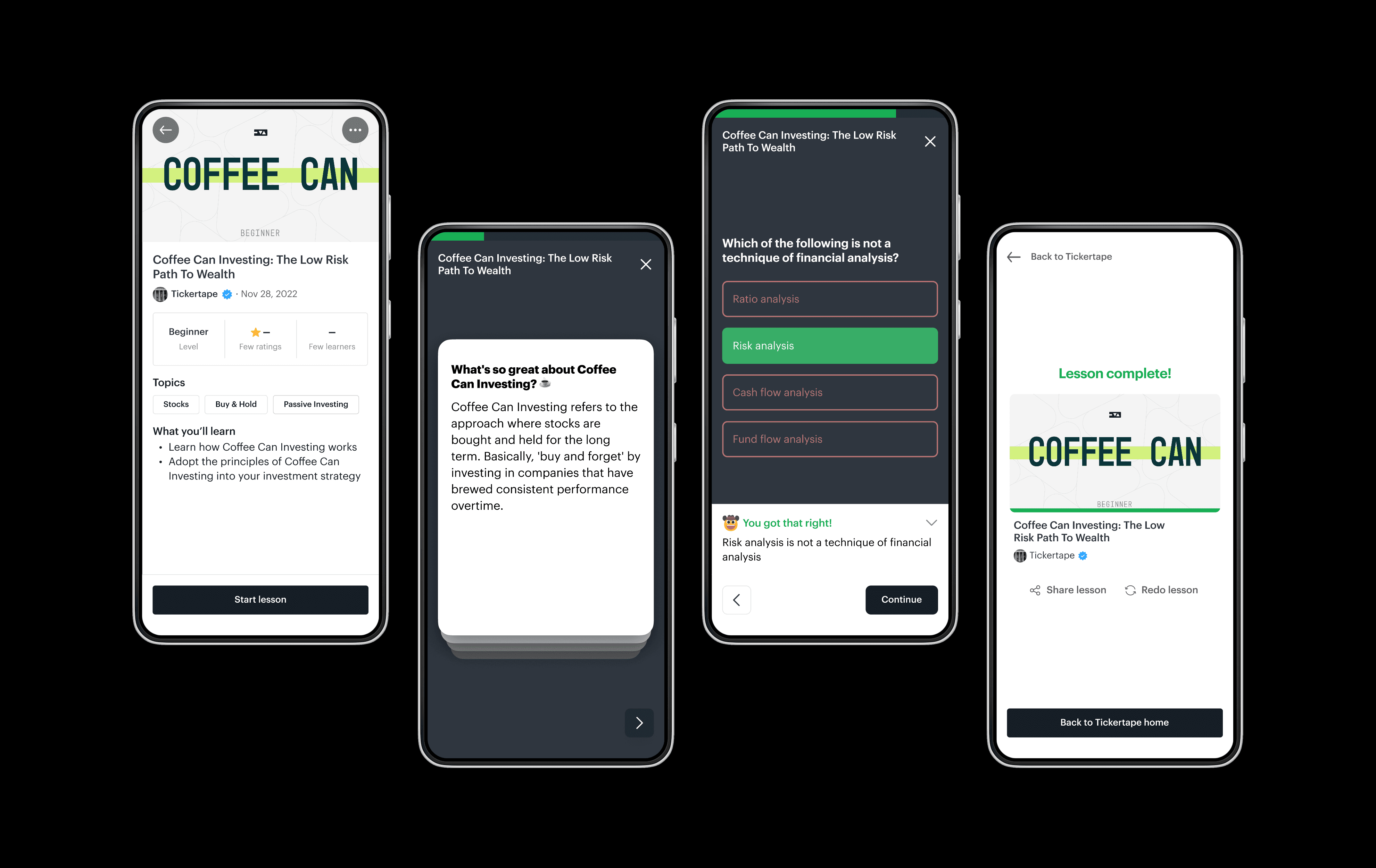
Here’s how the final experience looks like:
Up next, how we built Tickertape Home
(Case study coming soon)